DITW 04: Signage
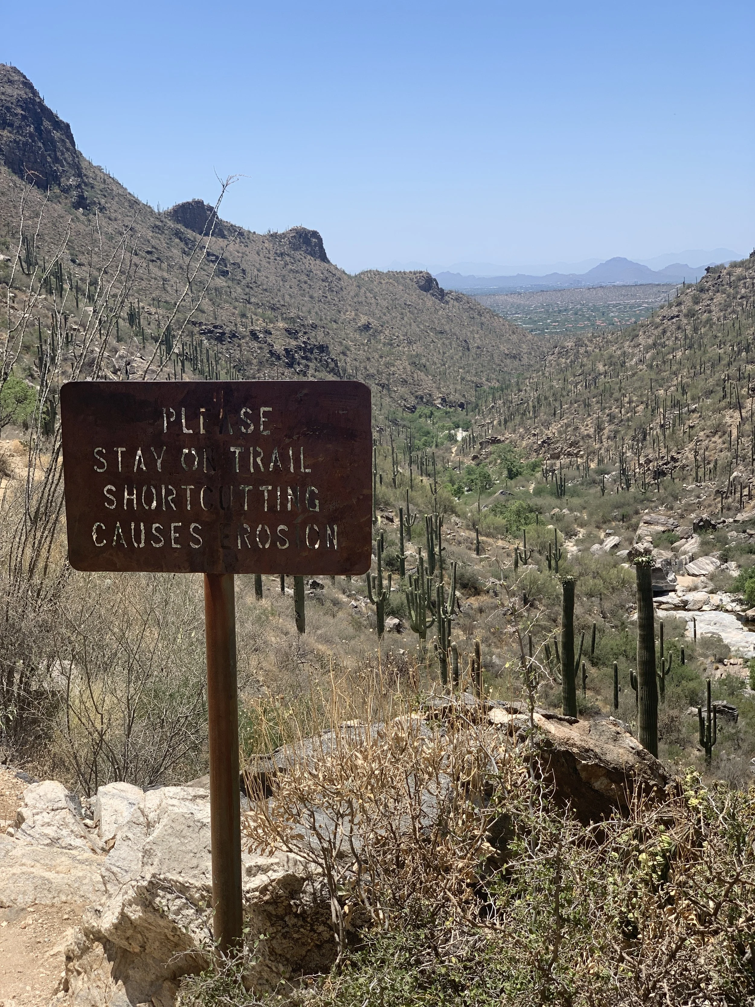
Image taken on a hiking trail in Bear Canyon in Tucson, AZ
Design in the World is a series of interesting moments and reflections on how design has an impact on making the world easier or harder to navigate.
What’s in a sign?
The world is filled with many signs. Some of them are natural, and some of them are artificial. Signs send signals and can be used to signify things, which Don Norman refers to as a signifier when applied to design. The iconic sign of a red hour-glass on a Black Widow spider signifies its deadliness to predators. Furniture with scratch marks along the base of the legs are signs that our puppy has been chewing on them. Billboards on the side of freeways are signs designed to influence us to buy into whatever they are selling, if only to make an initial impression and generate awareness. People send each other signs both verbally and non-verbally to communicate all sorts of things such as what they value. We sometimes put signs up to help imply what can be done, such as highway way-finding signage, or what not to do, such as a “No-Smoking” sign. In a sense, signs are probably one of the oldest means of scaling communication. By putting information in the world through a sign, you don’t need a person to explain something if you have a good sign. But, unlike a person, signs cannot persistently pursue our attention, they can be ignored, misunderstood, and are as effective as they are perceived by the recipient of the signal.
We were hiking in Tucson through an area called Bear Canyon. It was a scorching hot afternoon on a 7-mile hike with a beautiful waterfall nestled within a canyon acting as the pay-off for this adventure. A good place to cool off and enjoy the sights. While hiking we came across an extremely rusted sign. It was clearly designed to last given the sheet-steel material and the knocked-out typography- this sign was rusted to the bone and it was still legible. This corroding sign was asking us not to cut across paths in order to prevent erosion. The purpose of this sign was to protect the natural environment around it, but I suppose it also helps to protect the people on the trail. Staying on the trail is often safer than going off the trails after all., especially on rocky desert terrain with cactus and other environmental factors. This sign was doing doing a lot of jobs.
In design we also have the ability to implement signs into products in a much more subtle way through use of patterns and cues. Well-designed signifiers and cues can help people take short-cuts to completing different tasks when using a product. In game design, you can use subtle (or not so subtle) cues to hint where a player should go or do next to prevent them from getting lost or stuck. It’s been argued that a sign of poor usability is a product that requires a lot of educational materials to help people understand how to use it. The physical appearance of something can help explain how to use it instead. As Brenda Laurel wrote, “Interaction should be couched in the context of the representation—its objects, environment, potential, and tools.” That’s to say, interaction should be obvious in how the thing is represented. It should feel natural by design. Obviously there are exceptions, such as building DIY furniture and learning how to program robots. But when designing for everyday tasks, we should leverage patterns that people are familiar with instead of relying to heavily on explicit signs.

