
DITW 01: Enter Data
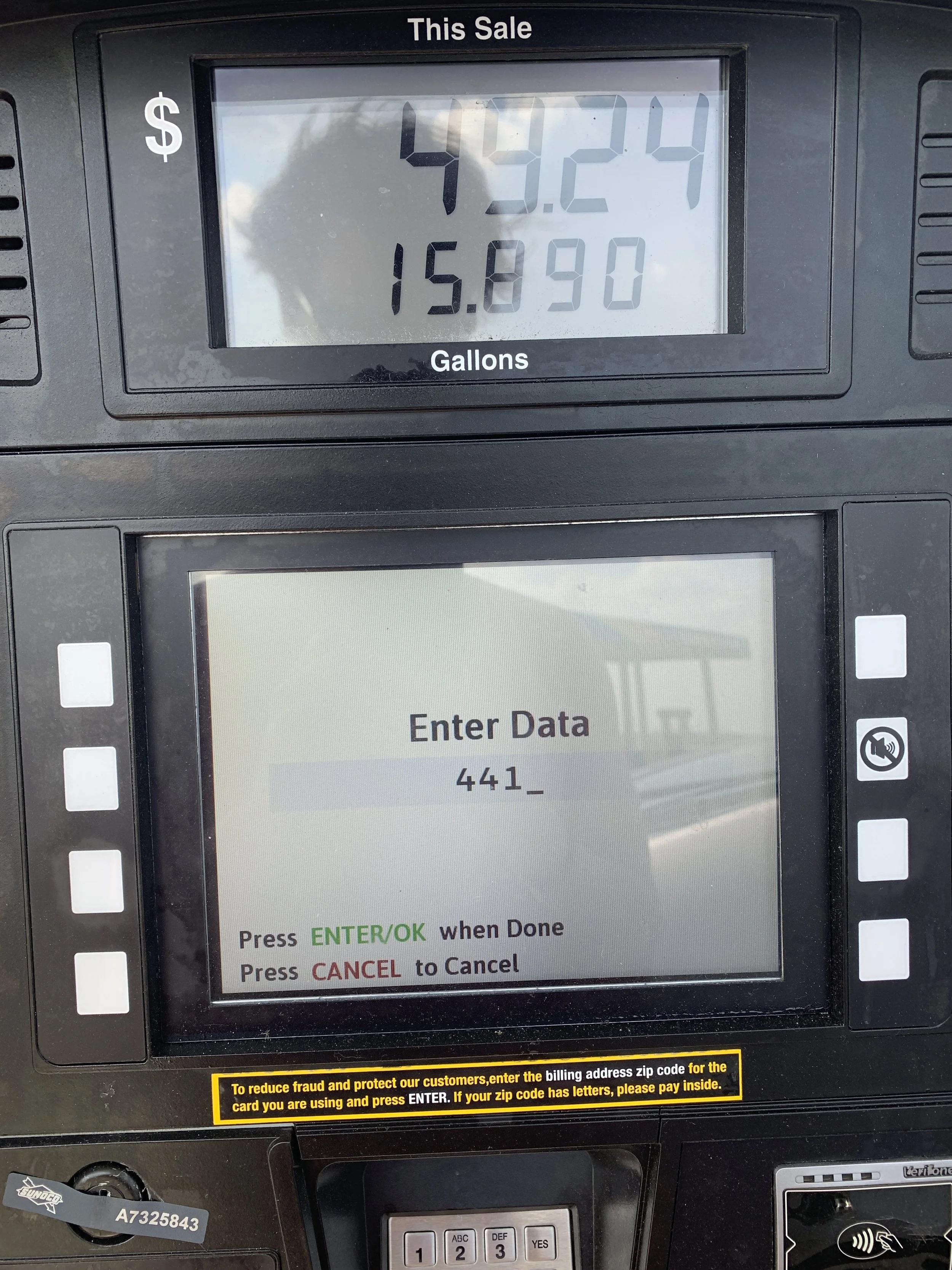
Image taken at a gas station in Howe on 2019
Design in the World is a series of interesting moments and reflections on how design has an impact on making the world easier or harder to navigate.
Enter Data
Was on a road trip through Howe, Indiana, and stopped to fill up on gas. Upon approaching the pump and swiping a credit card, was met with one of the most ambiguous requests: Enter Data. Now, the machine had constraints. One could really only enter a number judging by the number pad. So, leaning on conventions and patterns from past experience, it could be deduced that after swiping a credit card, the point of sale machine usually asks for a zip code. So that’s what happened, and it worked.
When a designer makes an interface to support a transaction, they are really designing for a conversation. Similar to a conversation with a friend or a stranger, there is (typically) an exchange of words to move the conversation along. Too many words, and the listener might be overwhelmed and unable to process what’s being said. Too few words, the communicator might come off as terse, unfriendly, or overly formal. But most of all, the words need to make sense. Unlike that with a friend or a family member, when someone is communicating through an interface, the machine typically cannot correct itself. It’s scripted. And, people usually have a specific goal in mind, something they want. So, the person gives the interface their time, effort, (sometimes) money, and attention (or other resources) to get that thing the machine is promising. In this case, that thing was gas to help us get to Chicago. It’s therefore important that the designer create interfaces that support a conversation that is meaningful - it supports people with meeting their goals. And, usable - the conversation can be easily understood and navigated.
Upon closer inspection of the image, there was a yellow label under the interface that instructed visitors to enter their billing zip code. Didn’t see this at the time, but led to more questiuons - was this “enter data” an intentional design decision? or, perhaps a poorly designed error state? Will never know why this interface was the way it was, or if the sticker put there was seriously meant to clarify what data the machine was asking for. Even with the yellow border pulling it up in the hierarchy, many people would miss it. Who knows.