Dashing Dashboards
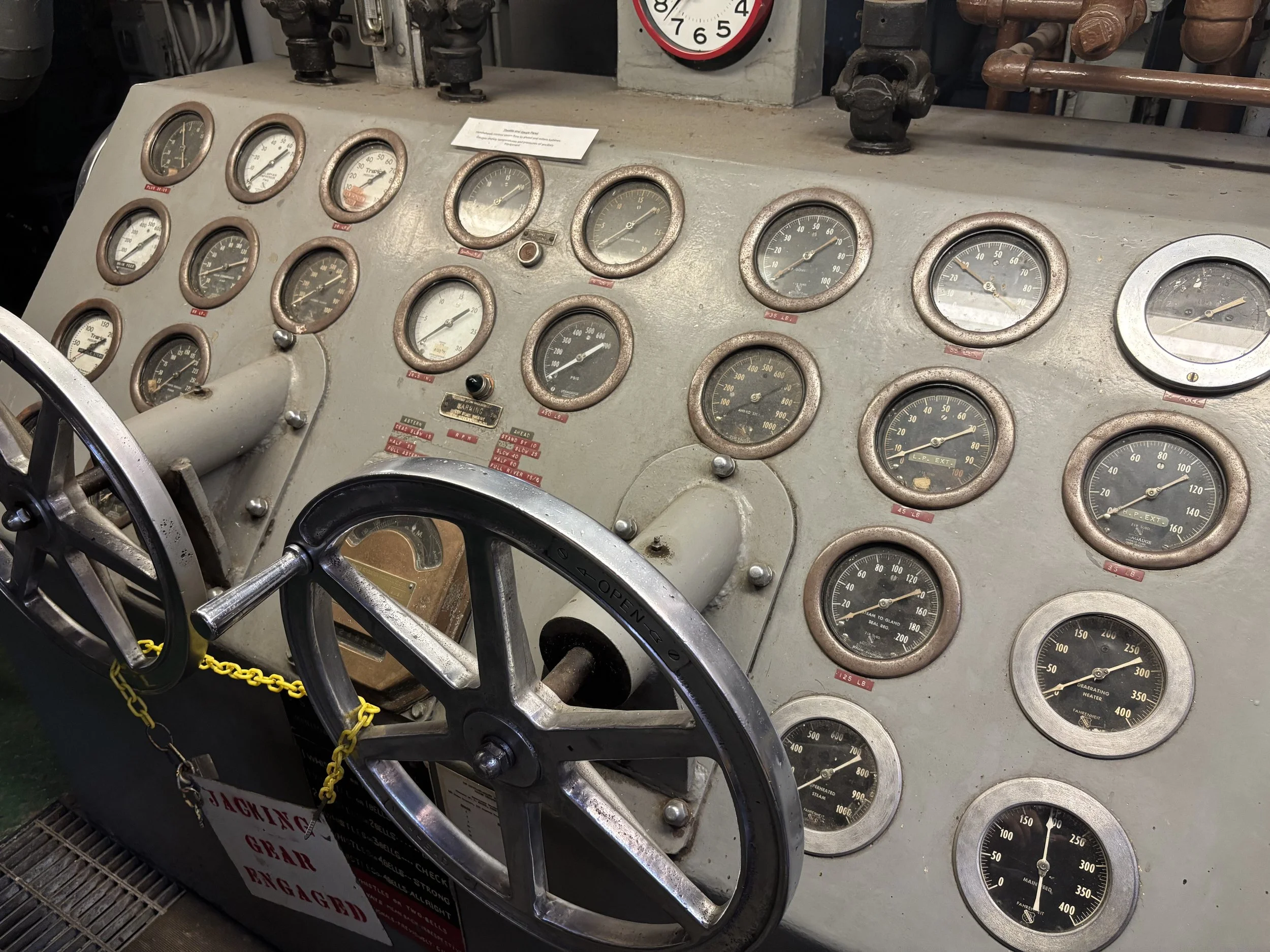
One of many dashboards aboard the Steamship William G. Mather Museum
Design in the World is a series of interesting moments and reflections on how design has an impact on making the world easier or harder to navigate.
What’s in a dashboard
In my 10 years as a Product Designer, that isn’t a single pattern that’s more prevalent than the dashboard. They are a given in most projects. Our teams have probably designed a hundred of them across a variety of verticals. Whether it’s a simple Power BI (MSoft’s standard dashboard tool) used to answer a small set of questions, or a custom built React front-end with all the fancy notifications, data visualizations, and interactivity one might expect from it- the goal is always the same: Help users understand the current state of their respective system and highlight what needs their attention while giving them entry points to dive deeper into any facet. Most importantly, we design the dashboard last. Why? Because we usually don’t know what data needs to exist on the dashboard or how to signify an issue until we have specified the guts of the entire system. Not everyone may agree with this approach, but we prefer to understand everything that needs to exist within the context of the system before we can establish information priority and hierarchy. In extremely complex domains like Supply Chain, the devil is in the details.
Cleveland has a lot of awesome museums: Cleveland Museum of Art, Natural History Museum, Rock and Roll Hall of Fame, Great Lakes Science Center, among others. One that we visit every now and then is the Steamship William G. Mather Museum. This museum is on board a boat built over 100 years ago and all components have been preserved from the bedsheets in the bedroom to the many controls in the magnificent engine room. It was shared with us (to paraphrase) that the engine required trained specialists who knew everything about how the engine worked and how to maintain it. Today, you could not simply send a picture to ChatGPT or Claude to figure out how to diagnose one of the many issues that might appear on the ship’s dashboard. This was a custom built machine. As you can see in the image above, this single dashboard shows twenty five different KPI readings with some value in pounds underneath them all along with lights that presumably glow to signify something, along with two wheels marked “open and close”. I won’t pretend to know what they mean, or what they do, but someone does. Like the cockpit of a plane, . this requires a specific set of knowledge that engineers had to be trained on.
When done right, dashboards are a very helpful way to understand system status. They should be designed so that they are easy to parse, and should draw attention to areas that require attention. First we need to understand the system- in this case, the boat’s entire engine- what are the components of an engine, how is performance measured, what are the signals of an exception, and what are the consequences of an exception taking place? With that information we can decide how to prioritize the contents of a dashboard and provide entry points to learn more. Looking back at this ship’s dashboard, I have to imagine that if a specialist saw an issue on one of the meters (e.g. L.P. EXT was maxed out to 100) then they would be scrambling towards an area of the magnificent engine where the issue might be taking place to learn more so that they can further diagnose or escalate the issue. That’s the kind of behavior that we design dashboards for. We filter out the important information from all of the information, and then provide paths for our engineers, operators, planners, etc. to learn more about the problem and how to solve it.
#CertifiedOrganic