
DITW 07: Information Hierarchy
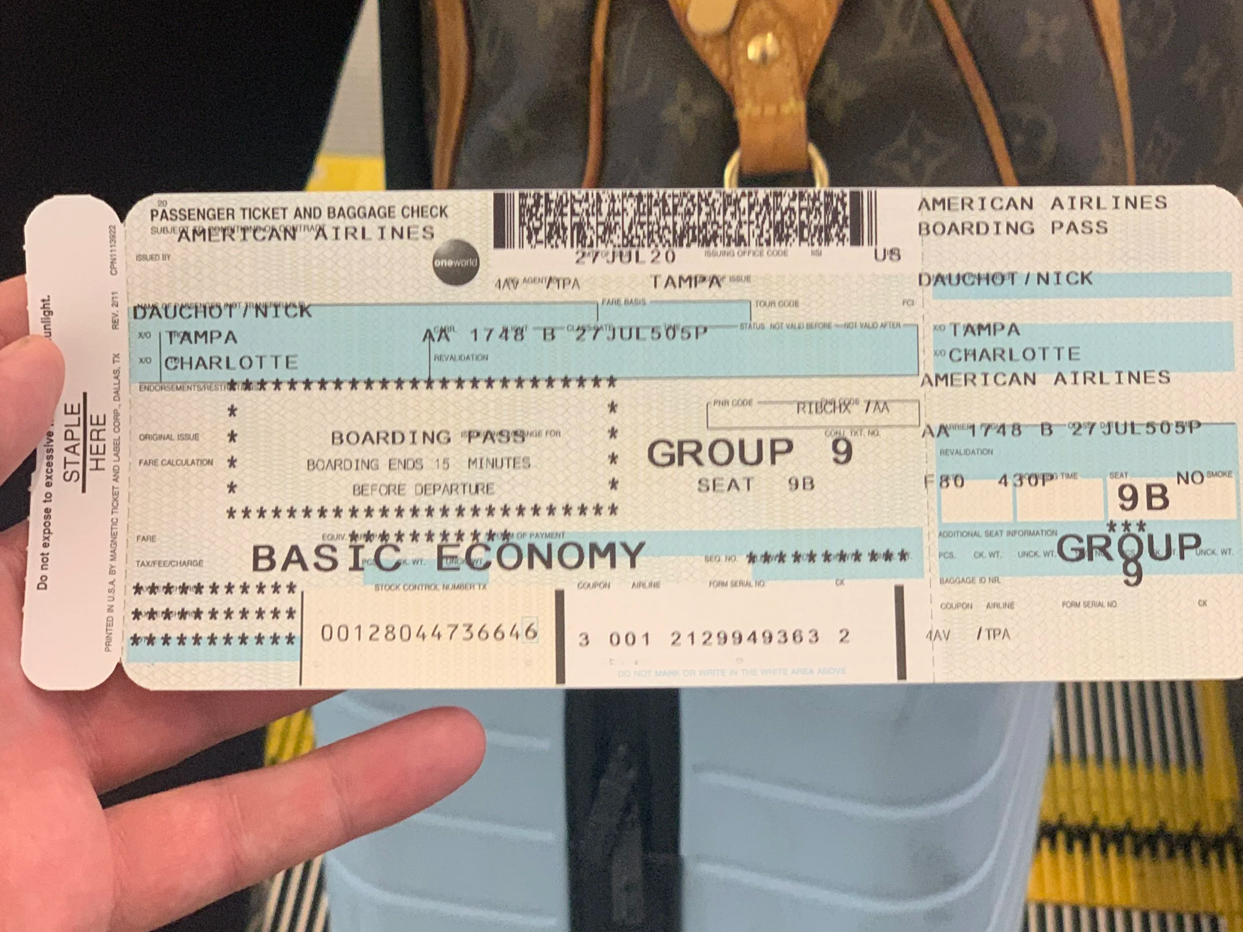
Image taken of a plane ticket while traveling, packed with type of all sorts of sizes
Design in the World is a series of interesting moments and reflections on how design has an impact on making the world easier or harder to navigate.
How information is organized matters, a lot
The way information is organized in the world better helps people navigate it. It’s pretty simple. From our street signs, food labels, maps, and news articles, the way words and media are organized help to make information out of structured assortments of data. We call this Information Architecture- the means by which information is organized across an experience. Too much information and it’s easy to become overburdened by it. I’m sure we have all heard to phrase “Drinking from the firehose.” When people are overwhelmed with information it becomes damn near impossible to process. I am absolutely guilty of this, as over my ten year design career there have been numerous times when I have put too much information in front of a client when all they needed was the skim.
I was taking a trip out to Charlotte for a conference and was granted a paper ticket with a ton of information on it. It’s a super cliche example, most Design and Information Architecture books talk about it- but these tickets make it difficult to pick the important information out of the clutter. The ticket included what some Content Strategists might call redundant information. The information on the left panel is repeated on the right. We have stock control numbers, random cereal numbers, coupon numbers and different things that don’t matter much to the passenger. Of course there is more than one persona than me (e.g. the airline associate looking at this ticket) but speaking for myself it was very difficult to figure out what I was supposed to be looking at. It didn’t help that the machine printing this ticket put some data outside of their fields, making it all the more difficult to parse.
Designers have a responsibility to ensure that the right information is served to the right persona at the right time to ensure a cohesive experience. Nowadays the vast majority of airline tickets are served to the end customer through their phone. This makes it much easier to focus them on information in the right context. If they haven’t checked in yet, they are prompted to check in. If they have checked in and are en route to their gate, it displays their gate number, boarding group, and seat front-and-center. During the flight itself the app switches to an entertainment mode providing context about the plane / flight itself. It’s all about giving people the right information at the right time, and not frustrating them with meaningless content. If the world wasn’t organized this way, it would be a very chaotic place. Some say that when UX / Information Architecture is so good, people don’t notice it at all, and that’s what businesses should provide to their customers when engaging with information in their experience.